When it comes to printing, the texture of the paper plays a pivotal role in determining the final quality of the printed image or text. Beyond just the weight and color of paper, its surface texture affects how ink is absorbed, how colors appear, and even how tactile the finished product feels. Whether you’re printing photographs, art books, brochures, or business cards, understanding paper texture can help you achieve professional and visually stunning results. This article explores how paper texture influences print quality and how to choose the right texture for your printing needs.

Understanding Paper Texture
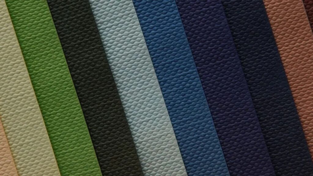
Paper texture refers to the surface characteristics of the paper, which can range from completely smooth to heavily textured or embossed. The texture is determined during the manufacturing process and can be altered with coatings or finishes.
Common textures include:
-
Smooth: A flat, even surface that allows for sharp, crisp prints.
-
Laid: Featuring fine parallel lines resembling old handmade paper.
-
Wove: A uniform texture with a subtle weave pattern.
-
Cold Pressed: A lightly textured surface common in watercolor papers.
-
Rough: A pronounced texture that adds visual and tactile depth.
How Texture Affects Ink Absorption
The surface texture impacts how ink interacts with paper:
-
Smooth Papers: Ink sits on top of the surface longer before drying, allowing for sharp detail and vibrant colors. This makes smooth papers ideal for high-resolution photographs and fine text.
-
Textured Papers: Ink penetrates unevenly into the grooves and valleys of textured surfaces, which can soften images and cause a more organic, less precise look. This effect is often desirable for artistic prints or portfolios where texture adds character.
Coated papers with smooth finishes limit ink absorption, preventing bleeding and ensuring color accuracy, while uncoated textured papers absorb ink more, often dulling colors slightly.
Influence on Color and Detail
Smooth, coated papers reflect light uniformly, enhancing color saturation and contrast. Textured papers scatter light in different directions, which can soften colors and reduce sharpness but add depth and richness to certain types of artwork.
Photographers and designers often prefer smooth gloss or satin finishes to showcase vivid colors and details. Conversely, painters and illustrators may choose textured papers to complement the tactile quality of their work.
Tactile Experience and Perception
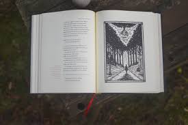
The feel of paper is a powerful, often overlooked aspect of print quality. Textured papers invite touch, engaging the audience beyond visual appeal. This tactile quality can influence how people perceive a brand, product, or artwork, making textured paper a favorite for luxury invitations, business cards, and fine art books.
Choosing the Right Texture for Your Project
Consider the following when selecting paper texture:
-
Purpose: For detailed photography or text-heavy documents, smoother papers ensure clarity. For artistic presentations, textured papers can enhance aesthetic appeal.
-
Printing Method: Inkjet printers work well with a variety of textures, while laser printers generally perform best on smoother surfaces to avoid toner inconsistencies.
-
Durability: Some textured papers are thicker and more durable, suited for portfolios or books that will be handled frequently.
-
Budget: Specialty textured papers often cost more than standard smooth papers, so balance your project’s needs with available resources.
Conclusion
Paper texture significantly influences print quality by affecting ink absorption, color vibrancy, detail sharpness, and the tactile feel of printed materials. By understanding these factors, artists, designers, and printers can choose paper textures that complement their work and elevate the final product. Whether aiming for crisp photographic prints or richly textured art portfolios, selecting the right paper texture ensures your prints make the desired visual and emotional impact.